
Our Branding Journey: 10 Years of Growth & Reflection


Over the past decade, Neighbourhood Holdings has grown from a small, values-driven lender into one of Canada’s leading alternative lenders. Our journey hasn’t just been about changing colours or logos; it’s been about refining who we are, what we stand for, and how we make people feel when they work with us.
As we celebrate our 10-year anniversary, we’re reflecting on a decade of steady growth, continuous improvement, and a shared mission to make lending fairer, faster, and simpler for Canadians.
From Humble Beginnings to National Reach
When we started in 2015, we were a team of five with one goal: to bridge the gap between prime and private lending. We wanted to offer flexible, transparent solutions for borrowers who didn’t fit the traditional mold, and give mortgage brokers and investors a partner they could rely on.
Ten years later, we’ve grown coast to coast, with over $2 billion in funded mortgages, more than 700 investors, and a national reputation for transparency, consistency, and unbeatable service.
2015–2019: Finding Our Foundation
Neighbourhood was founded in 2015 with a simple mission: to make mortgage financing fair and accessible for Canadians who traditional banks often overlooked. Our early brand reflected this practicality: straightforward and trustworthy, built around the essentials of credibility and stability.
As our business evolved, so did our understanding of who we were becoming. By 2018, we took time to look inward and ask ourselves the deeper questions. Who are we? What do we believe in? Why do we exist? That first brand exercise wasn’t about visuals; it was about purpose. It gave us a stronger foundation built on transparency, empathy, and consistency.
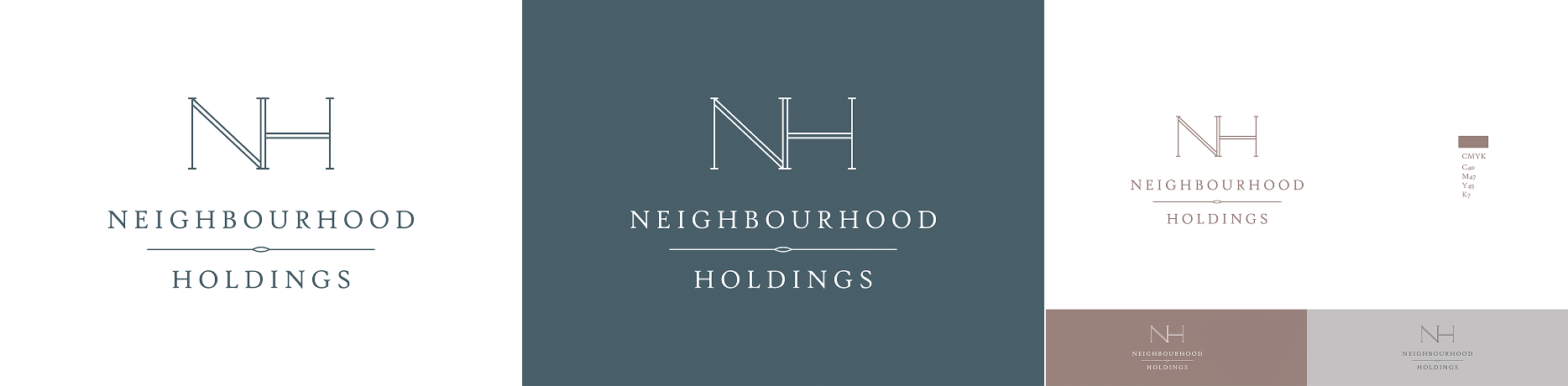
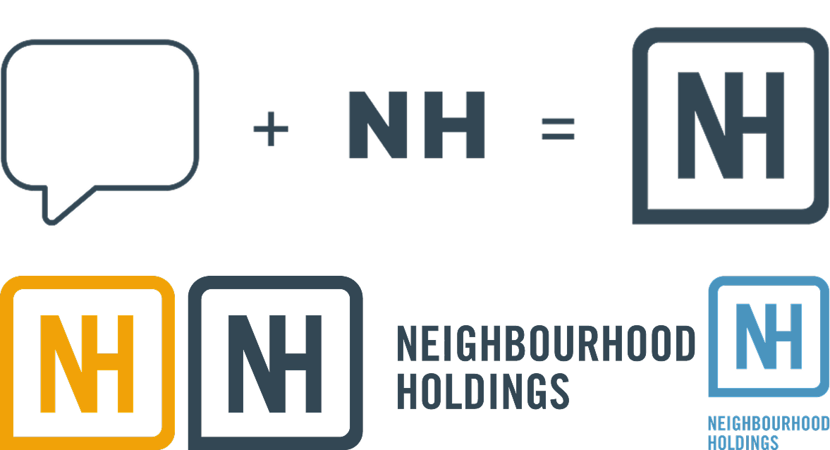
The following year, that clarity came to life. In 2019, we introduced a refined logo that marked our transition from a promising startup to a well-established player with a purpose. The new design brought our initials, “NH,” together within a text box — a simple yet meaningful symbol of open dialogue and collaboration. It reflected our belief in creating an environment where ideas can be shared freely and voices are heard. For the first time, our visual identity truly captured the spirit of who we were becoming.
2020–2024: Growing, Defining, and Modernizing
The years that followed were all about scaling with intention. As our footprint expanded, we continued to refine our brand to reflect our maturity, credibility, and leadership.
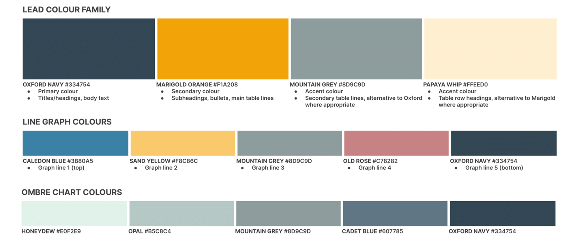
By 2021, we had transformed our website from a simple presence into a full digital experience — one that represented our growth and professionalism. Alongside it came Brand Colours V2, featuring deep navy that signalled trust, growth, and balance. These colours became the visual language of reliability and progress, and a reflection of how our audience saw us.
In 2022, we went deeper, codifying our brand strategy through a comprehensive identity and messaging framework. This was the year we embraced our archetype: The Visionary Leader — confident yet empathetic, ambitious yet grounded.
From this came our enduring values:
- Dare to Disrupt – bringing meaningful change with purpose and courage.
- Walk the Talk – leading with integrity and consistency.
- Energize with Knowledge – empowering through expertise.
- Foster Relationships – building genuine, lasting trust.
These values became more than brand statements — they became the foundation of how we work, communicate, and lead.
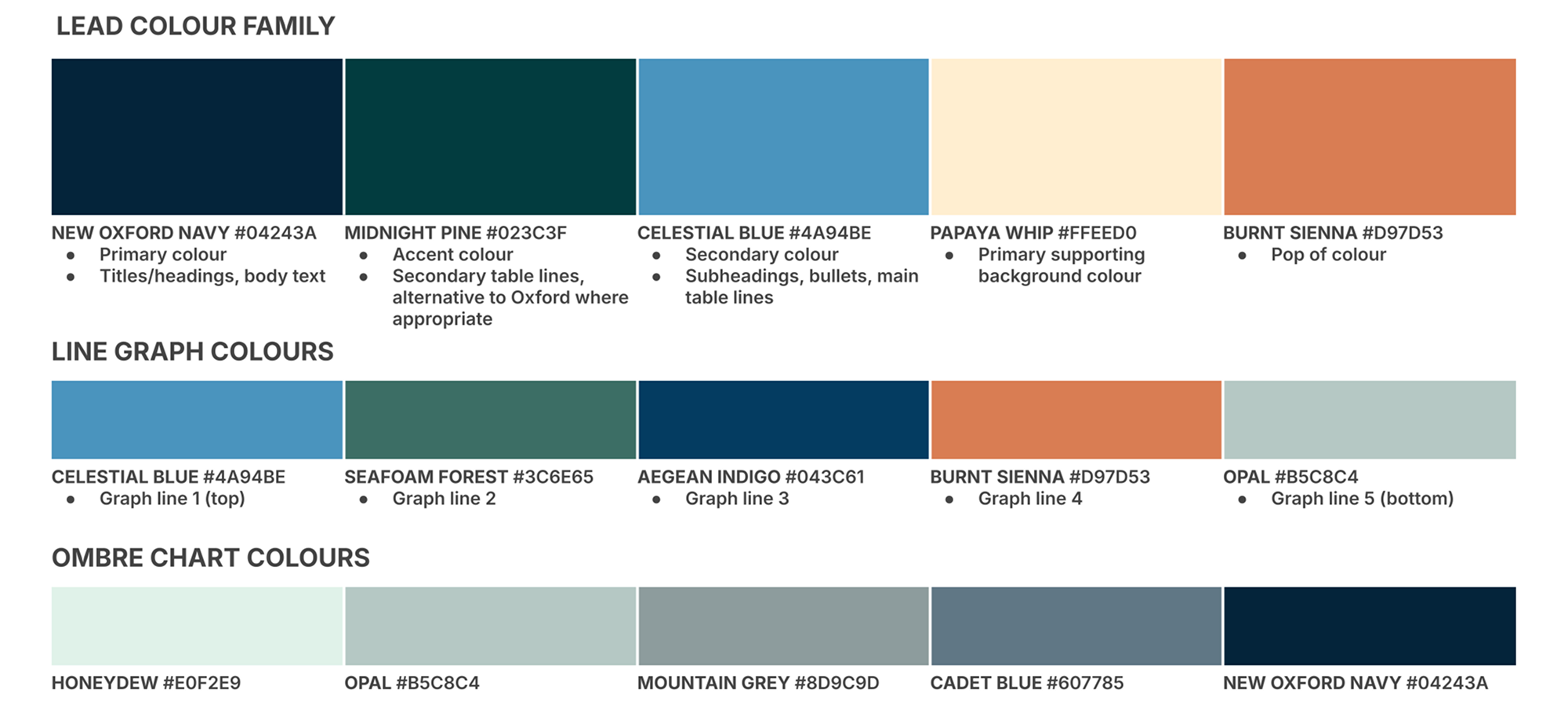
By 2024, our identity had evolved once again with Brand Colours V3, a modernized palette that better reflected the energy and ambition of a national team. The goal wasn’t to reinvent ourselves, but to express the momentum we’d built. We had become a lender known for speed, clarity, and dependability, and our visuals needed to capture that same confidence.
The updated design balanced familiarity with freshness, representing a company that was not just growing, but maturing — bold enough to innovate, steady enough to lead.
2025: A Bolder, More Distinct Neighbourhood
As we entered our 10th year, we knew it was time for more than a touch-up. Our 2025 Brand Questionnaire and Exercise revealed a gap: while our brand was trusted and professional, it didn’t fully express the boldness, agility, and ambition driving our team.
We partnered with Glasfurd & Walker to evolve both our verbal and visual identity — not to reinvent who we are, but to sharpen it. The goal was to create a brand that mirrored our unique position in the market: a progressive non-bank lender grounded in trust and discipline, yet unafraid to innovate in an industry dominated by legacy institutions and flashy fintechs. We wanted an identity that felt as approachable and human as the relationships we build, while expressing the confidence and sophistication of a company leading the future of alternative lending.
The result is a refined, cohesive brand system that balances maturity with modernity — one that speaks directly to the brokers, advisors, and investors who value clarity, consistency, and connection.
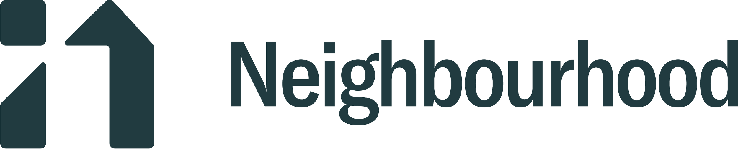
Our New Identity
- Logo: A refined mark where every line is intentional — softened edges, equal weights, and alignment that reflect balance and trust.
- Typography: A semi-serif logotype with a lighter weight and increased spacing that feels friendly and approachable while staying visually balanced with the brand mark.
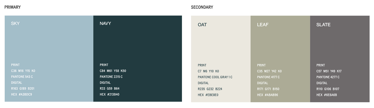
- Colour Palette: A harmonious blend of calm and confidence that feels natural, grounded, and timeless with Sky, Navy, Oat, Leaf, and Slate.
Together, these elements create a visual language that feels distinctively Neighbourhoo: confident without arrogance, modern without losing warmth, and timeless without being static.
This evolution is not about chasing trends; it is about alignment. It ensures that how we look and sound truly reflects who we have become: a trusted, visionary leader redefining what lending can feel like—fair, fast, and accessible for everyone.
Looking Ahead
As we look to the next decade, our focus remains the same: staying true to who we are while continuing to evolve. Our goal is to lead that transformation by staying grounded in our values while pushing boundaries with purpose and creativity.
Our refreshed identity marks the beginning of that journey, connecting where we’ve come from with where we’re headed next. But one thing will never change: our commitment to making lending fairer, faster, and more simplified for all. Because in every “neighbourhood”, there’s a story worth supporting, and we’re here to help it grow.
Latest articles


